A CSS-first peek sheet over a full-bleed map
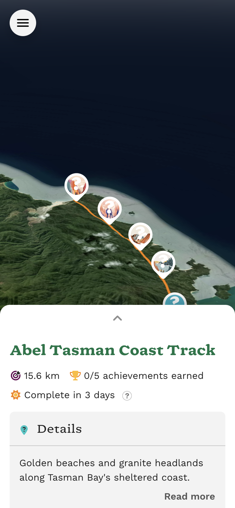
On Virtualtrails, route and journey pages are a sidebar next to a map. On a phone, that used to stack all the copy first, with the map in a rounded square below the fold. I wanted the map full-bleed instead, with the sidebar content in a sheet that peeks up from the bottom. I knew there were some CSS options for native scrolling, so I thought I’d give it a try without a library or JS. I didn’t quite manage to avoid JS altogether, but in the end it was only required for some iOS Safari quirks (of course).
Layout
The page itself is the sheet. A transparent spacer at the top of the
overlay is sized with calc(100dvh - var(--bs-peek-height)), so at rest
you see about 40% sheet and the map above it. dvh
is the dynamic viewport height: it tracks Safari’s toolbar as it shows
and hides. $peek-height is a Bootstrap variable (40dvh) exposed as
--bs-peek-height.
The map is position: fixed underneath. The overlay has
pointer-events: none and the sheet pointer-events: auto, so a pan
on the spacer reaches the map and a pan on the sheet scrolls the page.
<%= turbo_frame_tag :overlay,
      class: "peek-overlay position-relative position-lg-static z-index-2 pe-none pe-lg-auto",
      data: { controller: "peek-sheet" } do %>
  <div class="peek-spacer d-lg-none" aria-hidden="true"></div>
  <div id="peek-surface" class="peek-surface pe-auto rounded-top-4 shadow-up">
    <a href="#peek-surface" class="peek-toggle d-lg-none" aria-label="Expand panel">…</a>
    <%= yield %>
  </div>
<% end %>
Most of that is Bootstrap utility classes: responsive position,
z-index 1–3, pointer-events, rounded-top, and an upward
shadow-up. _peek-sheet.scss only holds what utilities can’t do,
mainly the spacer height, safe-area padding, and a smaller logo so the
nav still fits on one row. The first version was about 110 lines of
custom CSS; I cut it down on purpose to lean on Bootstrap’s utility API.
I first made the overlay its own overflow: auto scroller and locked
the body. That works in Chrome. WebKit will not start a touch scroll
inside a pointer-events: none container, even if the child you
touched has pointer-events: auto. Debugging, I noticed that
scrollTop stayed at 0 until I took pointer-events: none off the
scroller. So below lg the document scrolls instead, the overlay is
position-relative, and the body is no longer overflow: hidden.
Desktop keeps overflow: auto on the overlay, because there the
sidebar is a normal column.
Once the document is the scroller, Safari’s toolbar collapses as you
move, which changes the visual viewport. A map pinned with top and
bottom grew with it, Mapbox re-centred, and the map looked like it was
scrolling with the sheet. lvh
is the large viewport height (toolbar collapsed) and does not change, so
the map is height: 100lvh. The spacer stays on dvh so the peek still
tracks the visible screen.
@include media-breakpoint-down(lg) {
  .peek-map {
    height: 100lvh;
  }

  .peek-spacer {
    height: calc(100dvh - var(--#{$prefix}peek-height));
  }
}

@include media-breakpoint-up(lg) {
  .peek-overlay {
    overflow: auto;
  }
}
Expanding the sheet
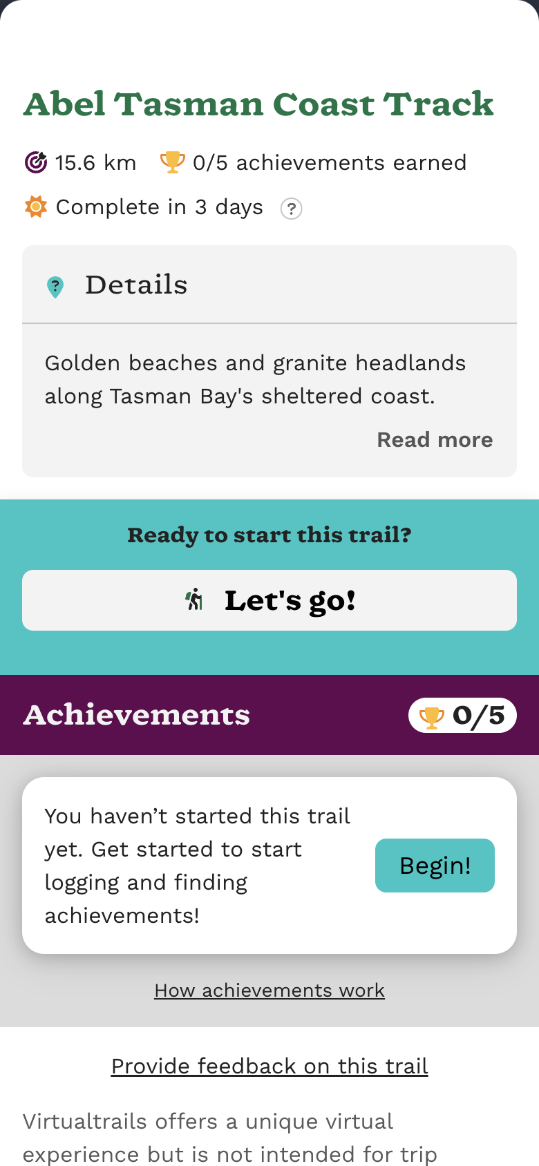
The first version had a drag pill at the top of the sheet. It looked
like you could grab it, but dragging anywhere on the sheet already
scrolled, so the pill did nothing. I replaced it with a hash link to
#peek-surface.
That hash link is the expand control. scroll-behavior:
smooth
on html:has(.peek-overlay), and only when
prefers-reduced-motion: no-preference, turns the jump into an
animation without JS. Collapsing is still dragging down.
Fading the chevron uses scroll-driven
animations.
Instead of a duration, animation-timeline: scroll() drives the
keyframes from the nearest scroller. animation-range sets which
portion of that scroll plays the animation: here, from rest to fully
expanded, 0 calc(100dvh - var(--bs-peek-height)). @supports
(animation-timeline: scroll()) means browsers without the API keep the
chevron visible.
The floating map nav is position: fixed, so it can’t use the sheet as
its nearest scroller. scroll(root block) points the same animation at
the document’s block axis instead of the default scroll().
@media (prefers-reduced-motion: no-preference) {
html:has(.peek-overlay) {
scroll-behavior: smooth;
}
}
@supports (animation-timeline: scroll()) {
@keyframes peek-toggle-out {
to {
opacity: 0;
visibility: hidden;
}
}
.peek-toggle {
animation: peek-toggle-out linear both;
animation-timeline: scroll();
animation-range: 0 calc(100dvh - var(--#{$prefix}peek-height));
}
@include media-breakpoint-down(lg) {
.peek-overlay .map-nav {
animation: peek-toggle-out linear both;
animation-timeline: scroll(root block);
animation-range: 0 calc(100dvh - var(--#{$prefix}peek-height));
}
}
}
Overscroll
Pulling the sheet past either end rubber-bands the page and drags the
fixed map with it. overscroll-behavior
is the CSS for that, but it does not stop document overscroll in Safari.
A small Stimulus controller is the workaround. It records the touch’s
clientY on touchstart, then on touchmove (a non-passive listener,
so preventDefault() is allowed) it cancels the gesture if you’re at
the top of the page and pulling down, or at the bottom and pulling up.
Desktop (min-width: 992px) and touches that didn’t start in the sheet
are ignored.
import { Controller } from '@hotwired/stimulus';

class PeekSheetController extends Controller {
  private startY = 0;
  private readonly desktop = window.matchMedia('(min-width: 992px)');

  private readonly _onTouchStart = (event: TouchEvent): void => {
    const [touch] = event.touches;
    this.startY = touch.clientY;
  };

  private readonly _onTouchMove = (event: TouchEvent): void => {
    const [touch] = event.touches;
    const target = event.target as Node;

    if (
      !event.cancelable ||
      event.touches.length !== 1 ||
      this.desktop.matches ||
      !this.element.contains(target)
    ) {
      return;
    }

    const delta = touch.clientY - this.startY;
    const atTop = window.scrollY <= 0;
    const atBottom =
      window.scrollY + window.innerHeight >=
      document.documentElement.scrollHeight - 1;

    if ((atTop && delta > 0) || (atBottom && delta < 0)) {
      event.preventDefault();
    }
  };

  public connect(): void {
    document.addEventListener('touchstart', this._onTouchStart, {
      passive: true
    });
    document.addEventListener('touchmove', this._onTouchMove, {
      passive: false
    });
  }

  public disconnect(): void {
    document.removeEventListener('touchstart', this._onTouchStart);
    document.removeEventListener('touchmove', this._onTouchMove);
  }
}

export default PeekSheetController;
Overall, I’m happy with the result. For a context where both the map and overlay are equally useful, this UI makes a lot of sense to me.